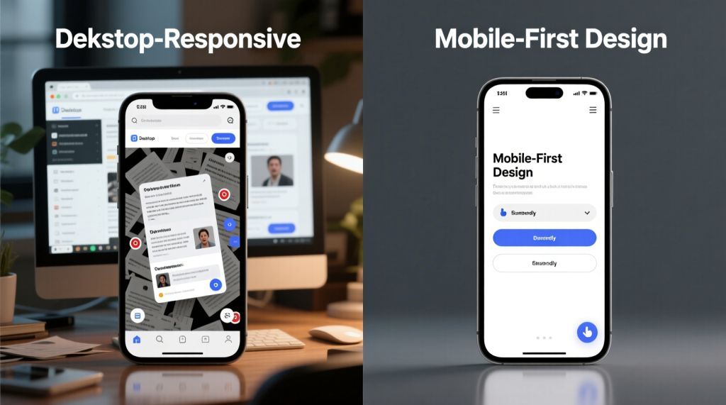
The digital world revolves around smartphones. Most online searches and website visits now come from mobile devices, with desktops playing a secondary role. This shift has fundamentally changed how websites are built. A site that doesn’t prioritize mobile users risks alienating visitors and losing search engine rankings. For businesses, partnering with a website designer who focuses on mobile-first design is essential to stay visible and competitive.
Google and other search engines rely on mobile-first indexing, evaluating your site’s mobile version to determine its ranking. If your mobile site is slow, clunky, or missing content, your SEO will suffer. A website designer must create a mobile experience that’s fast, intuitive, and complete, then adapt it for larger screens to ensure both user satisfaction and strong search performance.
Why Mobile-First Design Drives SEO Success
Search engines aim to deliver results that users find valuable. If a mobile user clicks your link and leaves due to a slow or awkward page, it signals poor quality. High bounce rates and low engagement hurt your rankings. A mobile-optimized site, however, keeps users engaged with quick load times, readable text, and seamless navigation, earning higher visibility.
Google has confirmed that mobile performance is a ranking factor. When two sites offer similar content, the one with better mobile optimization ranks higher. A website designer who builds with mobile-first principles ensures your site meets these standards, boosting both user experience and SEO.
Designing for Mobile Realities
Mobile-first design starts with the constraints of smaller screens. A website designer must identify what users need most. The core message or feature takes priority, with supporting elements arranged logically below.
Navigation needs to be simple. Complex menus frustrate mobile users, so a clean, collapsible menu with thumb-friendly buttons is critical. Text must be legible without zooming, and buttons should be easy to tap. Images need to balance quality and file size to avoid slowing the site.
A skilled website designer asks, “What does a mobile user need right now?” This focus creates a site that’s easy to use, keeps visitors engaged, and supports strong SEO performance.
Speed: A Core SEO Factor
Mobile users expect fast sites, often browsing on weaker connections than desktops. A slow site drives visitors away, and search engines notice. Google uses site speed as a direct ranking factor—faster sites rank higher, while slower ones fall.
What causes delays? Large images, heavy scripts, or poor hosting choices are common culprits. A website designer focused on mobile-first design optimizes images, streamlines code, and selects reliable hosting to ensure quick load times. Even small speed gains can significantly enhance user experience and rankings.
Keeping Content Consistent
Some businesses cut content on mobile versions to simplify the experience, but this harms SEO. Search engines view missing text or product details as incomplete information, lowering rankings.
Mobile-first design delivers the same content across devices, formatted for mobile readability. Short paragraphs, clear headings, and concise calls to action make content scannable without losing substance. A website designer who masters this balance ensures your site retains its SEO strength while being user-friendly.
Mobile Design and Local SEO
Many mobile searches are location-specific, like “dentists near me” or “coffee shops in my city.” A site that’s not mobile-friendly misses these opportunities. Search engines favor sites that load quickly on phones and include clear contact details, maps, and buttons like “call now.” Desktop-heavy designs often bury these elements, frustrating users and hurting rankings.
Local SEO is vital for small businesses. A website designer who prioritizes mobile-first design ensures your site captures local searches, helping nearby customers find you easily.
Questions to Ask Your Website Designer
You don’t need to be an SEO expert, but you should ask key questions when hiring a website designer:
- How will the site perform on mobile devices?
- Will all content be accessible on phones as on desktops?
- What measures will you take to optimize speed?
- Is the design aligned with mobile-first indexing?
A competent website designer will provide clear answers and showcase mobile-optimized work. If they focus only on desktop layouts, that’s a red flag.
Avoiding Mobile Design Mistakes
Businesses aiming for mobile-friendliness often fall into traps that harm SEO:
- Hiding content: Removing text or details on mobile reduces ranking potential.
- Slow performance: Large images or bloated code slow down mobile loading.
- Intrusive pop-ups: Ads that dominate screens annoy users and may trigger penalties.
- Neglecting local SEO: Omitting clear contact info or maps misses local search traffic.
- Desktop-first approach: Adapting a desktop site for phones creates usability issues.
A website designer who starts with mobile avoids these pitfalls, building a site that performs well across devices.
Beyond SEO: Meeting User Expectations
Mobile-first design isn’t just about rankings—it reflects how people live. Phones are the primary device for browsing, shopping, and connecting. A mobile-optimized site aligns with these habits, creating better experiences.
Search engines promote mobile-first indexing because it matches user behavior. When your site delivers what users want, rankings improve naturally. A website designer who understands this builds sites that resonate with both users and algorithms.
Conclusion
Mobile-first web design is a necessity in today’s digital landscape. Users expect seamless mobile experiences, and search engines demand them. Ignoring this risks lower rankings and lost customers.
A skilled website designer Singapore builds with mobile as the foundation, then scales up. This creates fast, intuitive, and content-rich sites that perform well across devices. By embracing mobile-first design, businesses can stay visible, engage users, and thrive in a mobile-driven world.


Leave a comment