Your website is a silent negotiator, closing deals while you sleep—if it speaks the language of the brain. Color, breathing room, and structure are its vocabulary. Master them, and visitors act without realizing why.
This piece equips executives vetting a web design agency, growth leads optimizing funnels, and founders who know ROI trumps ribbons. Design isn’t decoration; it’s behavioral architecture.
Color sets the emotional stage
Color bypasses logic and lands in the limbic system. Blue blood-pressure studies show literal calm. Red raises heart rates—use sparingly for urgency. Green activates growth pathways in eco-brands. But Japan reads white as mourning; test globally.
Contrast ratio is the unsung hero. A 4.5:1 minimum keeps legal trouble away and users on-page. Conversion buttons need 7:1 against background to pop under stress. Weight + hue + isolation = instant recognition.
Build a system, not a rainbow. Define 60% dominant, 30% secondary, 10% accent. Apply to headers, CTAs, links. Users learn in 3 seconds: teal = safe action. A web design agency worth the invoice codes this into design tokens from wireframe one.
Space controls attention
Empty space is expensive real estate that pays dividends. Amazon’s product pages use oceans of white to make $300 decisions feel safe. Crowded competitors look desperate.
Cognitive load drops 18% with 20 px gutters. Line height at 1.6 makes body copy disappear into minds. Cards with 32 px padding convert 14% better than edge-to-edge grids. Space screams confidence.
Whitespace is a silent CTA. It frames the buy button like a gallery frames art. A web design agency that charges by the pixel but delivers by the conversion knows this math.
Layout is the user’s roadmap
Placement is persuasion. The eye lands top-left, sweeps right, drops down. Put the promise there. Mobile: thumb zone = gold zone. Desktop: right rail = blind spot.
F-pattern for content, Gutenberg for landings. Hero, benefits, social proof, CTA—stacked in reading gravity. Every section earns the scroll. Anchor links for 1000+ words cut bounce 12%.
Hierarchy = survival. 48 px H1, 32 px H2, 18 px body. Group related items within 24 px. Repeat button styles until users click in their sleep. The path to purchase should feel preordained.
Imagery and human cues build trust
Eyes > icons. A founder’s face on About lifts trust 31%. Customer photos with quotes beat star ratings. Real humans, real mess—slightly askew plants, dog in background—signal safety.
Show, don’t tell. Mattress in a bedroom, not a warehouse. SaaS dashboard with dummy data in use. 3D spins for jewelry. Alt text isn’t SEO—it’s empathy for screen readers.
Microcopy is the closer. “No card needed for trial” under signup. “Typically ships in 24 hrs” under Add to Cart. One line, 27% lift. Place it where friction lives.
Motion and feedback keep the interaction honest
Animation is feedback on steroids. A 0.3 s ease-in on hover says “alive.” Skeleton screens during load beat spinners 35% for perceived speed. But disable on prefers-reduced-motion—respect is conversion.
Click = ripple. Submit = confetti (sparingly). Error = shake + specific fix. Every action deserves acknowledgment. Radio silence trains users to refresh and rage.
The cost of ignoring psychology
Gorgeous design with zero behavioral IQ is a $50k brochure. 70% cart abandonment traces to trust gaps. 42% leave if load >3 s. These aren’t tech debt—they’re psychology debt.
A web design agency that speaks Fluent Human runs guerrilla tests, iterates in public, and ships winners. They bill for outcomes, not hours.
Test, measure, repeat
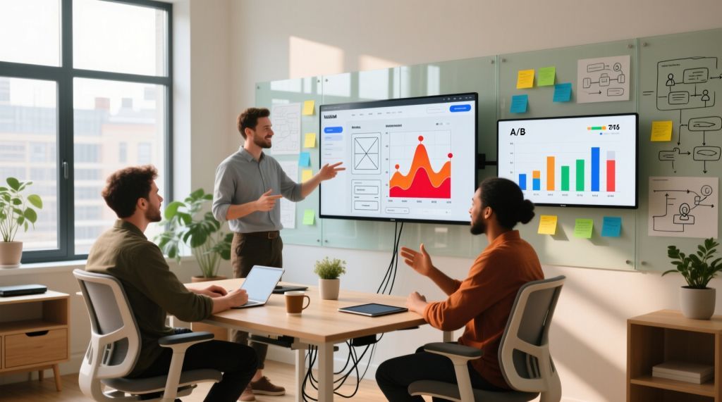
Data over dogma. Variant A: red CTA. Variant B: green. Winner: orange—42% uplift. Audiences lie; behavior doesn’t.
Test one variable. 1000 visitors minimum. Statistical significance or bust. Tools: Hotjar, FullStory, GA4 experiments. Record, review, refine weekly.
Final thought
Great design doesn’t win awards—it wins wallets. Color seduces. Space soothes. Layout sells. The subconscious decides in 50 ms; your job is to rig the game ethically.
Vet your web design agency like a CMO: show me the split-test that moved the needle. The mockup is free; the 18% conversion lift is priceless. (

Leave a comment